

Healthcare Website Design: What Patients Look For Before They Book
Patients visiting a clinic website want answers to a few specific questions, fast. Design around those and bookings follow.
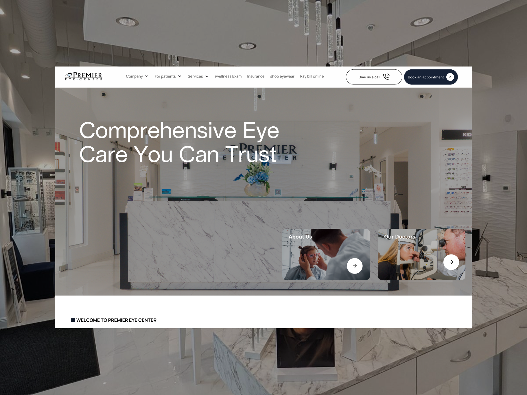
The short answer: patients come to a healthcare website to answer a handful of questions: do you treat my problem, can I trust you, is it convenient, will my insurance or budget work, and how do I book. A good clinic site answers each of those within a scroll or two, works perfectly on a phone, and makes booking obvious from every page.
1. "Do you treat what I have?"
Patients often search by symptom or treatment, not by specialty. Someone with blurry vision may not know whether they need an optometrist or an ophthalmologist.
- List services in plain language, with the medical term alongside where it helps.
- Give major services their own pages. It helps patients and gives search engines a page that matches each treatment.
- Explain what happens during a visit or procedure. It reduces anxiety and repeat phone questions.
2. "Can I trust you?"
Healthcare is personal, so trust signals carry a lot of weight.
- Real photos of your team and facility. Stock photos of smiling models are easy to spot.
- Practitioner bios with qualifications, specialties, and a short personal note.
- Reviews from real patients, or a link to your public review profiles.
- Affiliations and certifications, where relevant.
3. "Is it convenient?"
Location, hours, and parking sound boring but decide a lot of bookings. Put the address, opening hours, and phone number in the footer of every page, and on a dedicated contact page with a map. If you have several locations, give each its own page with its own details.
4. "Will this work for my insurance or budget?"
This is one of the most common reasons patients call instead of booking online. Where you can, list accepted insurance plans, typical price ranges for self-pay services, and payment options. Even a clear "call us to check your coverage" is better than silence.
5. "How do I book?"
Make booking the most visible action on the site.
- A "Book appointment" button in the header, visible on mobile without opening the menu.
- Online booking if your practice management system supports it; otherwise a short request form and a tap-to-call phone number.
- A clear note on what happens next, like "We'll confirm by phone within one business day."
Design for phones first
Many patients look you up on their phone, often right after a search or a referral. Test every key task on a phone: finding a service, checking hours, calling, and booking. Tap targets should be large, text readable without zooming, and forms short.
Accessibility matters more here
Healthcare sites serve older patients and people with visual or motor impairments more often than most sites. Use good colour contrast, readable font sizes, descriptive link text, alt text on images, and forms that work with a keyboard and screen reader. The WCAG guidelines are the standard reference.
Be careful with patient data
Contact and booking forms can collect health information. Depending on where you operate, privacy rules may apply to how that data is collected, sent, and stored, for example HIPAA in the United States. Check with your compliance adviser, and avoid collecting medical details in a basic contact form unless the tool behind it is set up for it.
Common mistakes
- A homepage about the practice's history instead of what patients need.
- Services hidden in one long page of jargon.
- Booking only via a phone number that goes unanswered after hours.
- Outdated doctor lists or opening hours.
Next step
Open your current site on your phone and try to book an appointment as a new patient. Note every point where you hesitate; those are the first things to fix. If you'd like help with a clinic website, book a free 15-minute call.
Want a website that turns visitors into clients?
Tell us about your project on a free 15-minute call. No pressure, just a clear plan.
Book a free call